In 2023, the eCommerce landscape is undergoing a seismic shift, and if you’re a business owner, there’s never been a more compelling reason to dive into the digital realm.
- By 2026, retail eCommerce sales in the US are projected to soar to a mind-boggling $1.672 trillion, constituting a substantial 21.2% of all retail purchases.
- Globally, the eCommerce juggernaut is set to reach a jaw-dropping $8.148 trillion by 2026.
- Mobile commerce is also rising, with the global mobile eCommerce market forecasted to skyrocket to a net worth of $3.43 trillion by 2027.
With such remarkable growth statistics, the question isn’t whether you should invest in eCommerce but why you haven’t already. If you’re ready to harness the immense potential of this booming market, you’re in the right place.
This blog will provide a comprehensive eCommerce mobile app development guide, ensuring you don’t miss out on the incredible opportunities ahead. So, let’s dive in and turn your eCommerce dreams into a digital reality.
Exploring the various architecture options for eCommerce application development
When developing an eCommerce app, choosing the right architecture for scalability and efficiency is crucial. Two popular options are Service-Oriented Architecture (SOA) and Microservices. Both approaches offer advantages, but their suitability depends on your project’s requirements.
In the following sections, we will delve deeper into these architectures, exploring their pros and cons to help you make an informed decision for your eCommerce application.
Option 1: Service-Oriented Architecture (SOA)
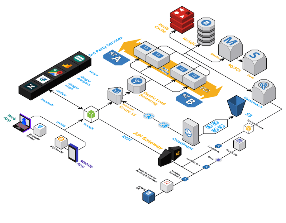
Service-oriented architecture (SOA) is an architectural approach for building flexible, reusable software systems using modular, loosely coupled services with well-defined interfaces. SOA services are independent, self-contained units of functionality that can be combined and orchestrated to create various applications and business processes. These services communicate by passing data in a common format, often using APIs.
Here are the benefits of SOA-based eCommerce applications:
1. Servers and load handling capabilities
If any ecommerce app is built on a monolithic or layered architecture, we can’t increase or decrease servers to match the server load fast enough. But with a load balancer in SOA, you can define::
- how you prefer to handle the incoming loads
- how to add or remove servers when there’s a fluctuating traffic
- how to set thresholds for costs
2. You don’t have to rely on a single language anymore
You can use Node.JS for API design and Python for server side programs – your choice!
If you understand what performance you can get from a particular language or a server framework, you are no longer bound by limitations to only use a few of them.
If you are curious to know about how node.js allows you to build scalable eCommerce backend then here is a blog post on Build eCommerce web application using NodeJs.
3. Can use different (types) databases to handle and store different information
Unstructured data like emails, customer data can be stored in a NoSQL database. Whereas any structured information will now be stored into a MySQL database. Using specific databases for specific usage not only improves performance, but also reliability in case of eCommerce apps.
We call this a Polygot database approach, you can read more about it here https://en.wikipedia.org/wiki/Polyglot_persistence
4. Partial separation of concerns
We have third party services operating in a separate server(s) from our core service. As we don’t control 3rd party services, they are a significant risk to our core infrastructure. If not well separated from our app infrastructure, their failures might cause your entire app to break down. Having third party services on a separate servers eliminates this risk.
5. Faster search performance with ElasticSearch
We now are using a Search as a service – ElasticSearch. It speeds up the way your system pulls information from your database using highly optimised indexing. It is worth noting here that search is one of the most frequently used part of an eCommerce app and has to perform really well.
6. Cache service
With a caching service, we look at the most frequently requested information, and create a data store (cache) for it separately. Now, when the same information is being requested by a user, it won’t go to your database, but, would instead be delivered from the cache.
But…
While this might seems like a good architecture for a proof of concept or an MVP, but it won’t work in cases where you are trying to achieve high growth or volume. eCommerce apps are supposed to follow a MVAP (Minimum Viable Awesome Product) philosophy right from the start.
Here are the drawbacks of SOA-based eCommerce applications in terms of scalability and performance:
1. No Benchmarks of for code scalability and performance
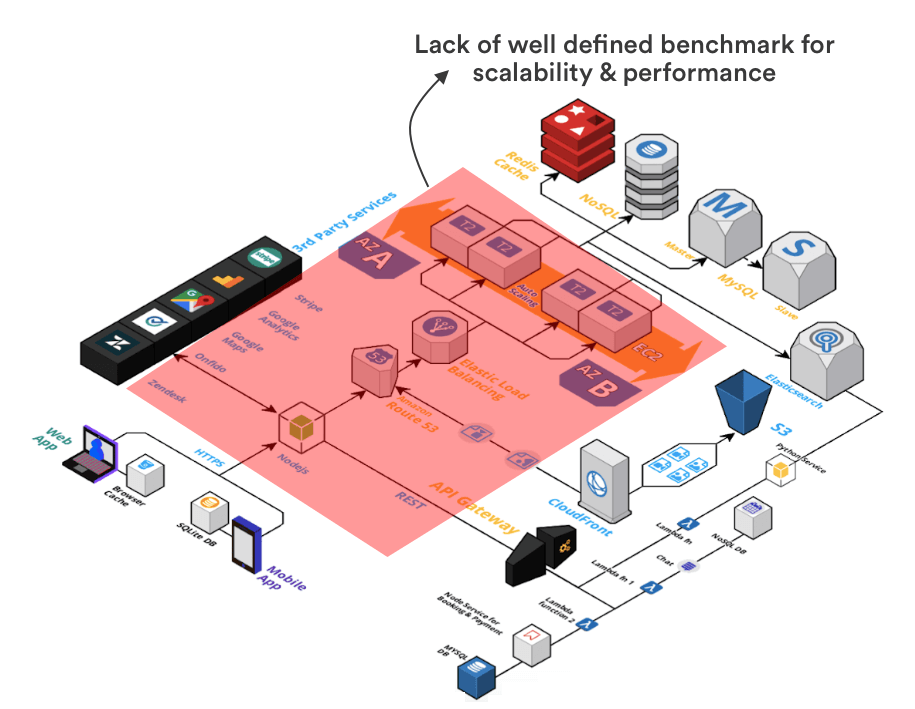
We do see information on how load balancers, server capacity and storage that we have – but we don’t exactly see how internal services are going to work with each other. So, that leads to a situation where we don’t know how to ensure “Adding items to the cart” works all the time, especially during a high velocity sale.
2. Database scalability and performance is not benchmark driven
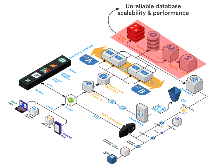
In this diagram we see that we have Database clusters that are connected with our services. There would be situations in which a particular database is heavily occupied by search queries, but our other services also need it for processing transactions. How are we going to determine which service to prefer? How are we going to decide from millions of possible problems which service to prefer? How are we going to make sure that information delivery is fast enough under all loads?
There are no definition of any of these things.
3. Resource and cost allocation of the system is unclear
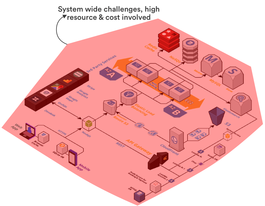
Simply put, we don’t know predictably how this system would perform at all. While we do expect it to perform relatively well, but it wouldn’t do so without having you bleed capital on unnecessary resources like costly servers, load balancers, etc without any empathy towards engineering best practices.
Let’s say thousands of dollars spent on advertising and influencer marketing did brought in 100,000+ potential buyers to your eCommerce app. If you don’t have a tech infrastructure that can scale reliably, what’s the point of spending all of this capital?
Your goal is to make sure that your entire system is and what capacity it is capable of serving. And, now that we have these numbers with us, our thinking would shift from scaling the entire stack to scaling different services (cart, product search, etc) to match these benchmarks.
We will now break down our eCommerce app into different services each of which has its own goals to serve. This is called following a microservices approach.
Option 2: Domain Driven Design (DDD) using microservices
Since eCommerce apps are extremely complex and they keep evolving, it makes sense for us to follow a domain driven design here.In domain-driven design (DDD) with microservices, you craft a system around distinct business domains, ensuring each microservice aligns with a specific domain’s requirements. You actively shape your services to directly reflect real-world business concepts, fostering clarity and agility. By adopting this approach, you empower your organization to develop, deploy, and evolve microservices independently, enhancing scalability, maintainability, and overall efficiency.
Based on domain driven design, let’s analyze how to build an eCommerce app using microservices by transforming server code into microservices.
This is what the evolved architecture would look like:
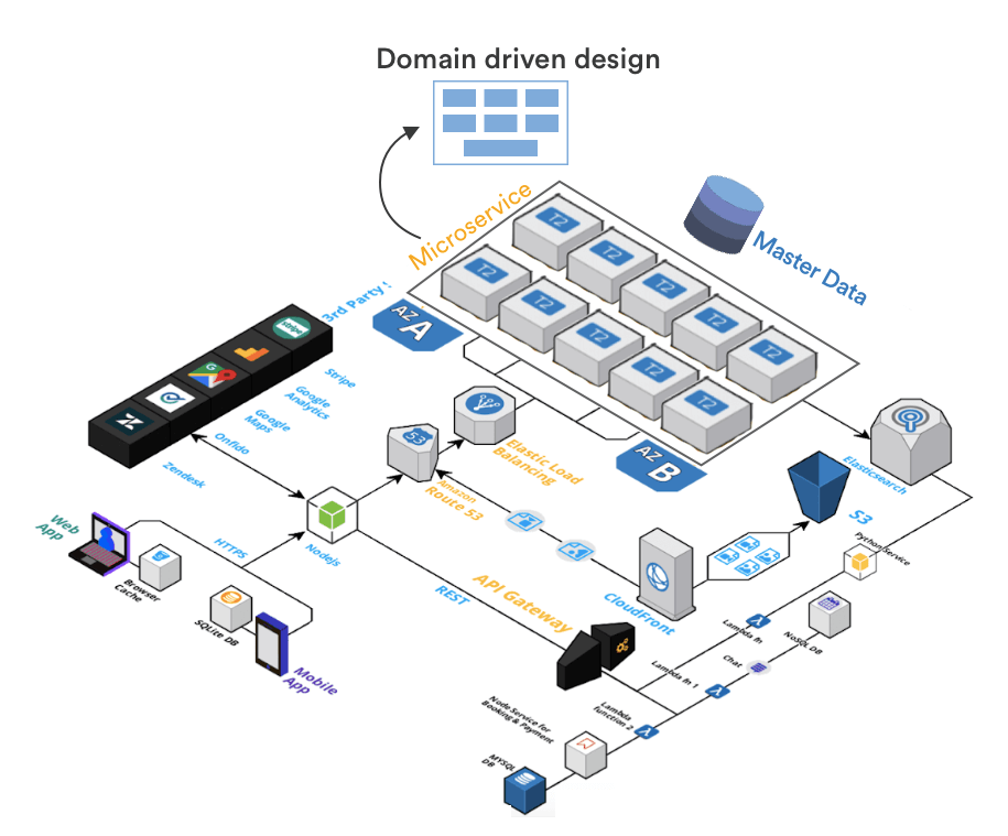
You’ll notice that our code is now divided into a bunch of well defined microservices. The image below shows you the top 10 microsevices that you would absolutely need in order to build a high performing, scalable ecommerce app.
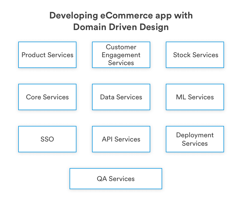
While, we’re going to cover developing eCommerce microservices in another blog post, let’s walk you through why they are extremely important for eCommerce apps.
Lets take a look at the Product search services – It should be able to handle 100M+ requests in a day. If we break down this microservice, you will find this service has:
- It’s own parameters for load balancers and scaling
- Well defined server RAM and Memory consumption
- Has its own dedicated database from where it can pull and show information. No other service can use this database
- Its own API to communicate and respond to user search requests
- Has a well defined boundary of what it can or can’t do
Now, let’s say if from a single server based service, you can at max only deliver product search to 1000 concurrent customers, you easily know how many servers it would take to handle 10,000 concurrent product search requests (1000 requests ~ 1 server, 10,000 requests ~ 10 servers). And thus you can reliably scale each of these services.
Another benefit of following a domain driven design is that the app becomes 100% testable. And, if you are planning to automate code deployment to your app, this would be extremely helpful.
All in all, this is what this architectural was actually benchmarked and tested for.
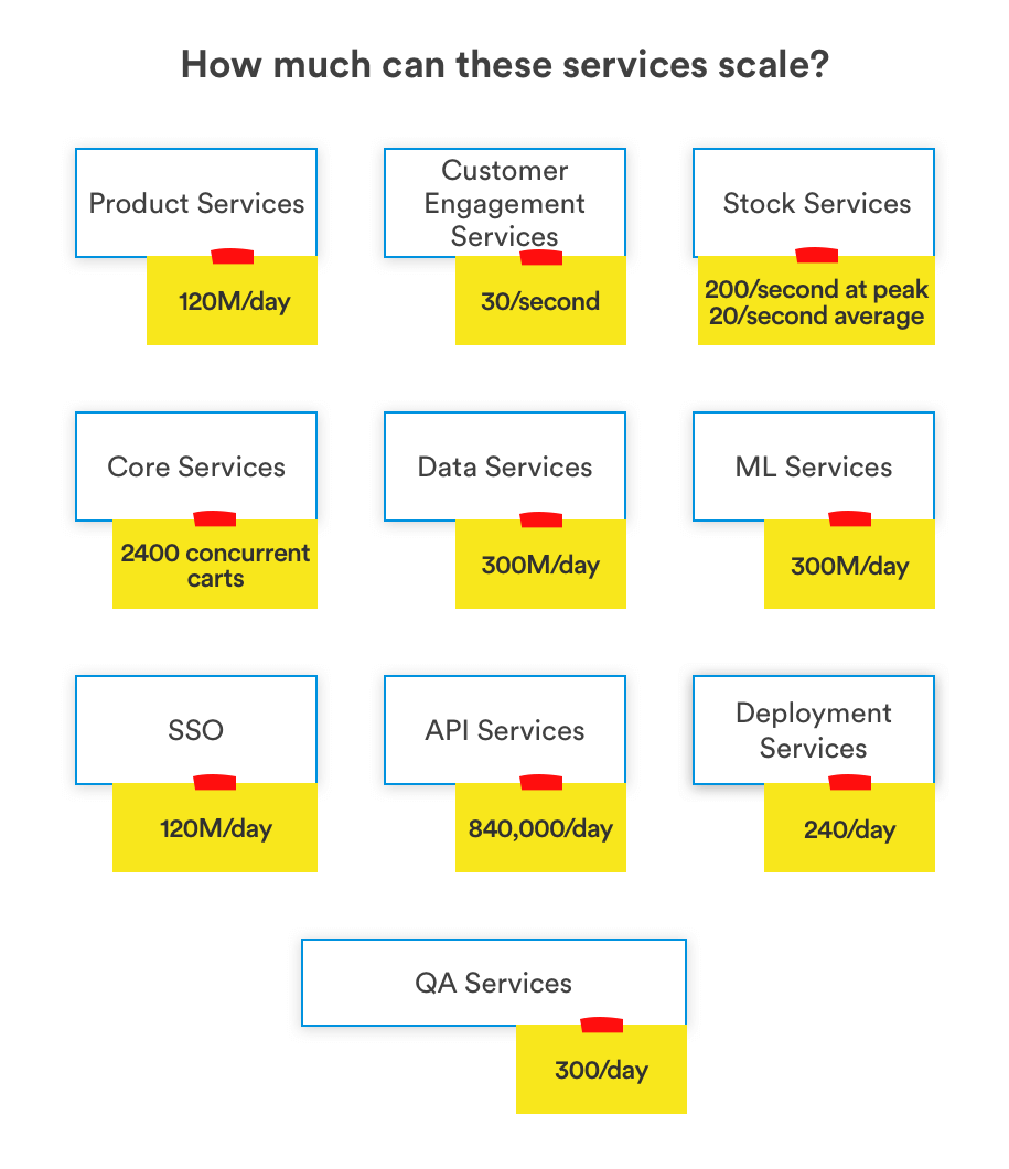
If you are interested in reading about eCommerce frontend development of your app, here’s a blog post on How to make an eCommerce site using ReactJS?
Scaling services for demand and performance
Now that we know what each service is capable of, individual stakeholders of each services can now scale these services up and down independent of entire ecosystem. This would also tell you what parts of your ecommerce app aren’t good enough for business requirements. You can exclusively focus and improve those parts.
For example, if you see your implementation of ElasticSearch isn’t good enough to deliver product search results in less than 200ms with a load of 1,000 concurrent users, you can look for alternative solutions. You can test alternatives and see how they work and deliver results, without significant investment and without breaking anything else.
Now, let’s understand the benefits of domain-driven design or using microservices with a hypothetical example.
John’s empty cart problem
John adds an item to cart when he was in London. He then travels to New York and logs into his account to complete the purchase.
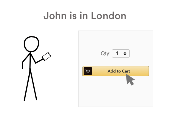

When he logs in, he sees an empty cart!
What really happened with John’s empty cart?
Without well defined microservices, when John added an item to his cart, it was added to a geo-local database.
Our app assumed that John lives in this region and won’t move out. Without domain driven design, stakeholders, product managers and developers had no idea that this could actually happen to them.
We usually build a golden record to handle such use cases. When we do that, we have a well defined and controlled boundary of data and John would be able to see this cart no matter where John lives.
We hope what you have learned so far improves upon your understanding to how to build a cloud backend for eCommerce apps.
If you are interested in evaluating Serverless tech, you should definitely checkout this blog on building eCommerce apps using Serverless by Rohit Akiwatkar.
Mobile eCommerce App Development
We will now start working towards building your understanding of how to make an ecommerce Android app. The way we will move forward now is by looking at the following aspects of ecommerce apps that are extremely critical to get right:
- Dynamic UI
- Building Product screens
- Elements of your app and how you should develop them
- Implementing reusability within your ecommerce app
- Offline capabilities to improve app user experience
Ecommerce apps with Dynamic UI
A consumer usually may or may not notice this, but as an ecommerce app developer you should know this. eCommerce apps undergo constant UI changes, some are a part of improving user experience, others are there simply because they are for a one time observable event like Black Friday.
Now, simply pushing UI updates to your app each time a new event is near isn’t possible because:
- App Stores aren’t very reliable in release management, and approval of an updated app version could happen sooner or later.
- Asking users to update their apps for an event like Black Friday or a UI intended for a Flash sale would only result in user churn
So, how would you solve this?
One way to do that is to plan upfront and compile all app UI in a quarterly app update. You can change this update frequency based on how frequently your users would be willing to update their app. But as a benchmark, don’t go below less than 2 months.
Now, when an app user updates their app, this is all what they are going to see.

While, this is what we are actually shipping
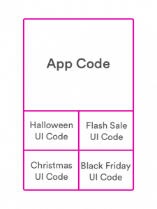
These user interfaces can be activated remotely when you wish to. Here’s what a user that has received a dynamic UI based ecommerce app sees during Black Friday, Halloween, Flash Sales and Christmas.
How do dynamic UIs work?
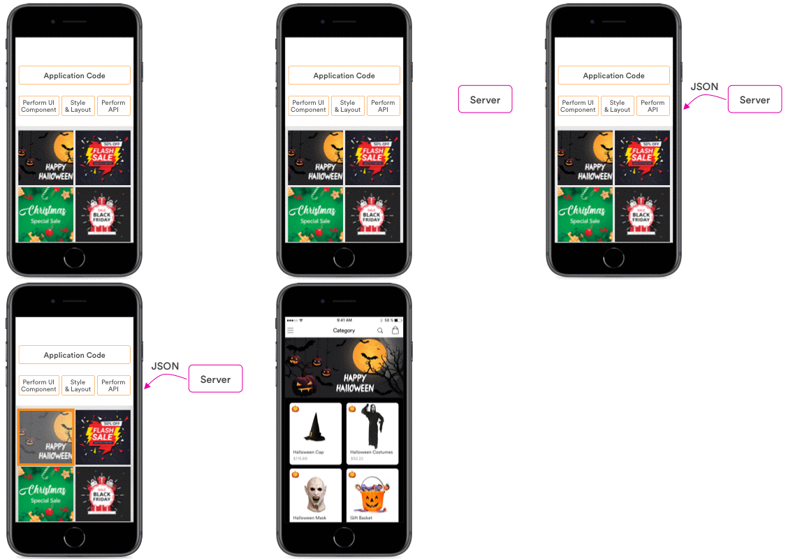
No matter how complicated this may sound to you, they are not that difficult to implement. While we package all of these UIs in one single app update, all we have to do to activate or deactivate these contextual user interfaces is just pass a message from our servers to the app.
A simple JSON message is sent over the app and activates a UI. The illustration below shows how it works.
Bloated app size
A huge concern here is that with dynamic UIs, we often end up increasing the app size. And increasing app size is one of the many criteria’s that violates the principles of developing an eCommerce app.
This is where we see React Native significantly outperform native. We will talk about that in a bit more detail in the next section.
App updates over the AIR
If we have to push updates to your app, we either have to do it using upfront heavily bloated app size or with lengthy (unpredictable?) app store/Play store review processes.
If you are planning to use React native for ecommerce application development, you can simply integrate your app with a service like CodePush. Using CodePush you can deliver small scale UI updates directly to your app users.
React native again reduces the app size here as we don’t need to package everything in UI upfront, we can simply push the UI using internet.
Further reducing your app size
Ecommerce apps uses a lot of images, and you won’t believe how unoptimized images are still being pushed to eCommerce apps. Optimizing images can reduce the app size by 20% in eCommerce apps.
To reduce image size, consider the following:
- Use compression tools like TinyPNG, compress image without losing any quality
- Ensure that very large images are not added to the app. Have image size validation scripts that triggers an alert if the images getting added are more than 50KB
- Avoid adding image resources, instead use XML drawable and vector drawable wherever possible
- Reuse same image in multiple places, color filter and rotation logic should be used
If you want to develop your app with best practices when it comes to app size. It is recommended that you should write a script, an app size watcher to keep track of app size with each build. There are several plugins available that integrate easily with your CI tools and can keep track of your app size.
How to build your product details screen?
One of the most important parts of an eCommerce app is the product details screen. If you plan to serve a large customer base, be prepared to have a screen that evolves extremely fast. With developers pushing minimum 10 different updates/changes to this screen everyday.
Product details screen is where users are going to decide whether they want to buy the product you are selling or not.
Let’s take the example of Groupon’s product listing screen here. There’s whole lot of design aspect that was applied by Groupon here to scale and deliver a product screen that could supports more than 200M app users.
Here’s how it looks:

Now, this may not be the traditional illustration of design to many. What we instead meant here in context to design was the UI engineering design. Let us explain to you a bit more:
- Product screens are often not developed by one, but many teams
- They evolve quickly and require high agility
- Each and every aspect of this screen has to be optimized for memory and load times
- Handling complicated edge cases
Clearly, if you don’t deal with this properly – you are in a for a ride of your life!
Groupon takes an entirely different approach to what most other eCommerce providers do while developing this screen. They break this screen into small subunits that work perfectly with each other, but are developed independently and are handled by separate teams.
So, a screen like this can be broken up into small components like these:
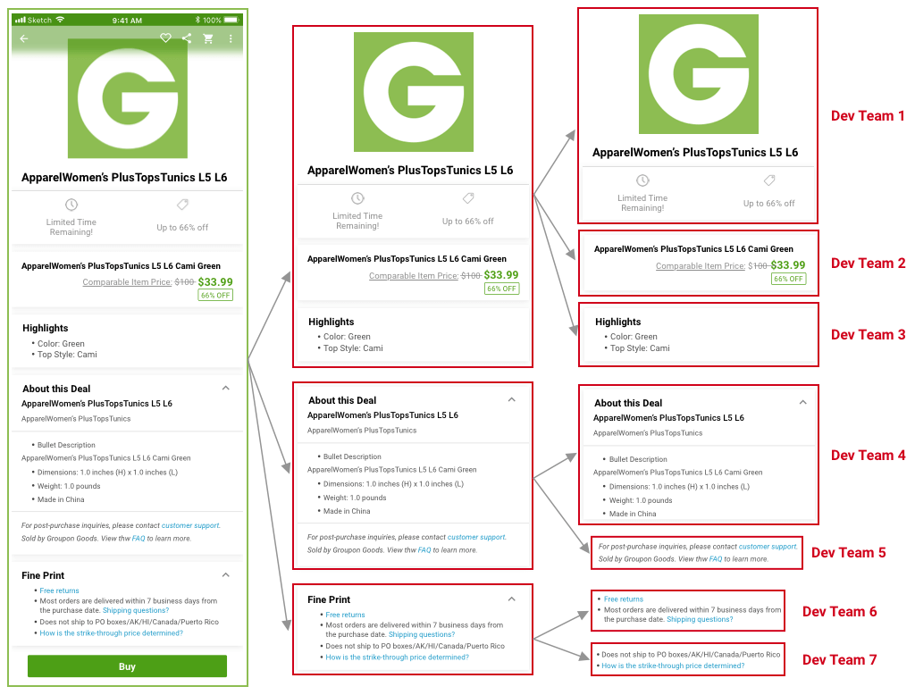
We won’t get into deep technical details here. But, this separation is the exact reason why developers working on “highlights” can update “highlights” section and not impact the overall performance of the screen. Whatever they do in “highlights” section is optimized and tested for performance. And the new “highlights” code can be reliably released and integrated with the rest of the screen.
Optimized performance
Following this modular approach to developing eCommerce app product screen not only helps you efficiently showcase long lists of items, but it also helps you efficient show only the part that’s available to the app’s screen
Add or subtract features with ease
As screen elements are independent of each other, adding or removing them takes 10% of the original effort had this practice not been in place. All of the features of the screen can be developed in total isolation.
Better utilize phone’s memory
Apart from optimized consumption, we get a lot more control over what we can do with the phone’s memory here. Groupon effectively pre-load elements of the product screen on phone memory that are yet to be displayed. They do that to drastically improve the load time to 1/10 of what it would otherwise be.
Reliable cache
Groupon takes it a step further while developing their product screen. They have implemented a reliable cache and recycle information that they use effectively re-display list items efficiently.
How to develop Product Image elements?
We talked about the product feature screen in the section above, and we will now pickup an element from it and walk you through real life complexities here. For the sake of simplicity, we’ll go with developing product image elements for an iOS based eCommerce app as we feel it would be a lot more intuitive for everyone reading this.

Challenge: Optimize a high performing image screen and eliminate uncertainty in performance
To build an image viewing element in our iOS app, we usually have three options:
- ScrollView
- CollectionView
- UIPageViewController
If these are new to you, don’t get discouraged by their names. Think of them simply as the way to implement image view elements in your app.
Let’s now evaluate each of them as we move forward and find out which one will give you the best performance.
ScrollView
Your developer places all of these images inside of ScrollView, the functionality would work fine and the performance for most parts would look just about right as well.
But then, you hear an app user complaining about app taking too long time to show images. You went back to your QA and dev team, raised some tickets on your project management system, only to find out automation tests and manual tests returning the results with no errors.
So, what’s really happening here?
When your developer built this product image screen in your app it was implemented using ScrollView. This ScrollView works fine for around 5-10 images with varying degree of results, but for most of the part it won’t show you any flags initially. But when you have a customer that is going to upload 30-40 images of a product, downloading these images in ScrollView gets extremely expensive for your app’s performance.
This is exactly what you weren’t aware of, your developers weren’t aware of, and your QA wasn’t aware of.
Using CollectionView
Now, you can build this using CollectionView as well. But, it’s an overkill. It was built for not just left and right, but up and down movements as well. We will explain to you why we shouldn’t opt for CollectionView at the end of this section.
On using UIPageViewController
We would straightaway recommend you to go for UIPageViewController instead. It is the same exact thing that you see when you scroll left on AppStore. And, It is also the same implementation that you find in iBooks app as well. iBooks can help you scroll through hundreds of pages without any performance issues or apparent lags.
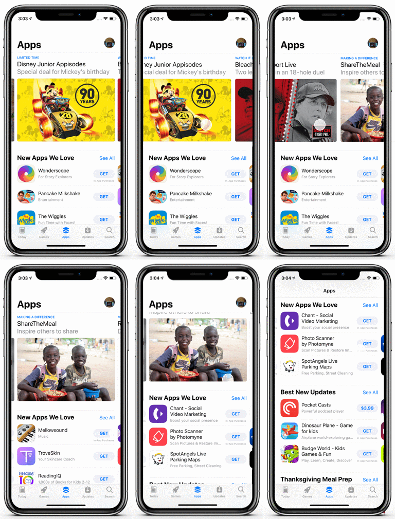
Now, getting back to why I wouldn’t go with CollectionView? First reason, engineering is about avoiding overdesign. Second reason, every unused or partially used library increases the size of your application. App size is a major concern for eCommerce apps as each and every percentage reduction in size leads to high sales and more adoption.
Standardizing icon images across screens on your app
So far we’ve talked about perfect components across a screen. But, let’s now look into a completely different type of optimization that you can do with your eCommerce app – Standardized icon images.
![]()
What we prefer here is to define upfront:
- How these icons would be displayed – This includes defining all business rules for display and settings that should applied to the images
- Make sure that the element that’s going to use these icons doesn’t have to worry or do anything to load and display these icons
We do that because after years of developing ecommerce apps, we’ve observed:
- Developers have their own ways of implementing even the simplest possible things. The performance, code quality and consistency of doing something in this case depends upon the skill of developer. This could potentially induce a risk.
- Using modular approach towards developing apps result in higher quality. For example, if an image (icon23.png) is attached to an element, there’s no possible way for anyone to know how deleting this file system image would actually impact the app. Icon23.png could be attached any of the 200 screens that we have in our app.
- You can’t document enough in the software world. And, even if you do, documentation alone isn’t enough to resolve challenges that are widespread in the software development world.
When we look into images that are extremely commonly used across the app, we see that the following are extremely common:
- Loading spinners
- Downloaded product images
- Placeholder images
- Download failure icon
- Feature icons
After building a list of such images, we would define one central place for each of them where we define how they would be loaded and displayed. Even the elements in which they will be loaded won’t have to worry about how this will happen.
If in future, If we decide to increase the size of icons from 12px to 14px in length, we won’t have to worry about applying the same change to 100s of screen. This not only saves a lot of time, but also helps us avoid the chances of any degree of compromise on performance or code quality when a developer updates this. Any changes would eventually be tracked an linked to this central location, and we can control what happens here.
Offline persistence in your app
If you are building an app for shopping for users on the go, giving them the ability to shop from whenever they want – you better be prepared for poor and intermittent network connections. Most likely, your app users won’t know if they have a poor network coverage, or whether your app isn’t working. They are most likely to blame your app!
Your app’s user would find it irrational to lose information that was just there a few seconds ago. Even if it vanished as he/she moved from one screen to another or minimized his app. Now, this is actually a poor implementation even from an engineering standpoint as well. As engineers, we don’t control the network, but we do definitely control some of the information that the app fetches from the server. If done properly, the app can actually retain some information and function well even when there’s no network connection.
We wrote an extremely detailed blog post around this a few months ago, if you want to read it in detail, here’s our take on building offline mobile apps.
Increasing reusability for eCommerce apps
For organizations that have multiple eCommerce apps, it often gets too expensive to develop these apps from scratch and maintain them. If that’s your use case, we would focus on identifying the foundational parts that are often common across these apps and just induce redundancy.
Once identified, we prefer to package them in form of an SDK and consume it across multiple apps.
Take the example of offline catalog storage services in your apps. You can easily see that this is something most of your apps would have as a feature. Now, while building this offline catalog service for the first time, you can carefully package it in form of an SDK.
When you build another app that needs a catalogue functionality, all your developer would need to do is to call this code and that’s it, it will work out of the box.
Adidas and other pioneers of mobile technologies in eCommerce leverage this extensively, they have SDKs that are being consumed in multiple other apps.
So far, we have covered what you should do while developing your eCommerce app to maximize efficiency and profitability. But let’s now get into what you shouldn’t do – the grave mistakes you should absolutely avoid if you want to ensure the success of your m-commerce app.
Mistakes to avoid while building an eCommerce application
The following aspects may come in the way of your eCommerce mobile app’s growth, so we strongly recommend you avoid these at all costs:
- Neglecting mobile optimization: Failing to make your application mobile-friendly can alienate many potential customers.
- Poor website performance: Slow loading times and crashes frustrate users and lead to high bounce rates.
- Inadequate security measures: Neglecting robust security can result in data breaches, eroding customer trust.
- Complex checkout process: A convoluted checkout process can lead to cart abandonment; simplify it for seamless transactions.
- Ignoring analytics: Without tracking user behavior and sales data, you miss out on critical insights for improvement.
- Underestimating scalability: Prepare for growth; an application unprepared for increased traffic can collapse under heavy load.
- Lack of mobile payment options: Embrace various payment methods to cater to diverse customer preferences.
- Inadequate customer support: Poor customer service can tarnish your brand’s reputation; invest in responsive support channels.
- Ignoring SEO: Neglecting search engine optimization can hinder your visibility in search results.
- Overlooking regular updates: Failing to keep the application up-to-date can lead to compatibility issues and security vulnerabilities.
Thankfully, we have a lot of examples to look up to when it comes to building a high-performance, user-friendly eCommerce app that also scales efficiently.
Successful eCommerce app examples
Let’s look at the successes of industry giants, gaining insights into their strategies and innovations that have reshaped online shopping.
1. Amazon
Amazon stands out with its robust technological foundation, which incorporates a combination of serverless computing, microservices, and AI-driven recommendation engines. This architecture guarantees both scalability and agility. In terms of performance, their app leverages edge computing to minimize latency, resulting in an improved user experience. Seamless integration of payment gateways and efficient logistics tracking adds convenience, while personalized product recommendations boost user engagement.
2. Alibaba
Alibaba boasts an architecture based on a cloud-native framework, enabling it to handle massive traffic efficiently. Utilizing containerization and Kubernetes, they achieve high availability and scalability. Performance is optimized through content delivery networks (CDNs) and intelligent caching. The app’s success is furthered by integrating Alipay for secure transactions and innovative features like live-streaming shopping.
3. Shopify
Shopify has garnered acclaim for its simplicity and versatility. Its tech stack leans on Ruby on Rails, ensuring rapid development and maintenance. The app’s architecture follows a multi-tenant approach, making it cost-effective and scalable. Performance is consistently high due to a global Content Delivery Network (CDN) and serverless infrastructure for peak handling. Extensive app integrations and a user-friendly interface add to its appeal.
4. Walmart
Walmart emphasizes a hybrid cloud architecture, combining private and public cloud services for optimal scalability. To boost performance, they employ edge computing and serverless functions to boost performance for quicker response times. A user-friendly interface, seamless checkout, and in-store pickup options enhance user experience, while predictive analytics improves inventory management.
5. Zara
Zara distinguishes itself with a minimalistic design and efficient tech stack. It leverages microservices architecture for agility and employs GraphQL for flexible API querying. Performance is upheld through optimized images and a lightweight front-end framework. The app’s success stems from its focus on fashion trends, quick inventory turnover, and an intuitive user interface that prioritizes product discovery.
Successful eCommerce app examples give you an idea of what kind of features and functionalities you should include in your eCommerce app. However, the question that needs to be answered is, how much do these features cost?
How much does it cost to build an eCommerce application?
Building an eCommerce application will cost you a variable amount depending on your specific requirements, features, and complexity. Factors like design, development, hosting, security, payment gateway integration, and ongoing maintenance influence the cost.
Basic eCommerce apps can start at around $10,000 to $20,000, while more advanced and customized solutions can range from $50,000 to several hundred thousand dollars. Additionally, you should also consider ongoing expenses for updates and maintenance.
The best way forward is to define your project scope clearly and work with experienced developers to get an accurate estimate tailored to your needs and budget.
This section must have given you a rough estimate of the budget you need to invest upfront for building a world-class eCommerce app. However, trends in eCommerce keep changing every now and then. So, being aware of those trends allows you to plan for the features you need to include, and based on that, you can get more accurate estimates.
Top eCommerce app development trends in 2023
In 2023, the eCommerce landscape is dynamic, driven by technological advancements and changing consumer preferences. As an eCommerce enthusiast, you must stay ahead of the curve to maintain a competitive edge.
In this section, we’ll delve into the top 10 eCommerce app development trends for 2023, highlighting their benefits and potential impact on your online business.
| Trend | Benefits |
| Gamification | Enhances user engagement, loyalty, and retention through interactive experiences. |
| Augmented Reality | Allows customers to visualize products in their real environment before purchase. |
| Virtual Reality | Creates immersive shopping experiences, especially in the fashion and luxury sectors. |
| Chatbots | Provide instant customer support, improving response times and user satisfaction. |
| Voice Commerce | Simplifies shopping for customers through voice-activated searches and purchases. |
| Personalization | Tailors product recommendations to individual preferences, boosting conversions. |
| Sustainable eCommerce | Attracts environmentally conscious consumers and reduces your carbon footprint. |
| Social Commerce | Integrates shopping seamlessly into social media platforms, tapping into a vast user base. |
| Mobile Commerce | Optimizes eCommerce apps for mobile devices, catering to the growing mobile user base. |
| Blockchain | Enhances security, transparency, and trust in transactions, critical for online purchases. |
Concluding
That’s pretty much it for the blog post. We hope that we were able to walk you through the complexities involved in ecommerce application development, and when you develop ecommerce apps we hope some of these strategies would solve real growth problems for you.
If you have any questions, or want to talk about ecommerce application development process at length – get in touch at hardik@simform.com
Want to Build an E-commerce App?
FAQ
To develop an eCommerce mobile application, we at Simform, a leading eCommerce development company, follow these steps:
- Requirement analysis: We start by understanding your business needs, target audience, and unique requirements.
- Design and prototyping: Our team creates intuitive UI/UX designs and prototypes to ensure a user-friendly experience.
- Development: We develop your app using the most suitable technologies, ensuring responsiveness and scalability.
- Testing and quality assurance: Rigorous testing ensures a reliable, bug-free application.
- Deployment: We deploy the app on the chosen platform, iOS or Android.
- Maintenance and support: Post-launch, we offer continuous support and updates to keep your app running smoothly.
- Marketing and optimization: We help you market your app and optimize it for better user engagement and conversion rates.
With our expert guidance, you can achieve a high-quality eCommerce mobile app tailored to your business needs.
The cost of making an eCommerce mobile app varies based on your specific requirements and features. Factors such as app complexity, design, platform (iOS, Android, or both), and development team rates can influence the cost.
Generally, a basic app may cost around $10,000 to $50,000, while more complex ones can range from $50,000 to $250,000. To get an accurate estimate, consult experienced app developers and discuss your project’s details and goals.
The time it takes to build an eCommerce app depends on factors like complexity, features, and team efficiency. On average, it may take several months to a year or more. To ensure a quicker development process, collaborate closely with a skilled development team, have a clear project scope, and utilize existing platforms or templates. Prioritize critical features for an efficient timeline. Remember, timely testing and refinement are essential for a successful app launch.
You gain many advantages when creating your eCommerce app with Simform. Simform offers tailored solutions that cater to your specific needs, ensuring a seamless and personalized shopping experience for your customers. With our expertise, you benefit from cutting-edge technology, robust security, and user-friendly interfaces.
Our dedicated team provides continuous support and updates, keeping your app at the forefront of innovation. Moreover, our cost-effective solutions help maximize your ROI. By partnering with Simform, you unlock the potential to boost sales, enhance customer engagement, and achieve your eCommerce goals effortlessly.

Rajive
Amazing Post Hardik!
Gerard
This was a great read, thanks Hardik.
Dhanesh D
Really helpful knowledge you have shared.. Thanks a lot
Vedant Darji
Nice Article! It's helpful info you have shared.